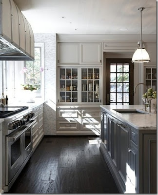
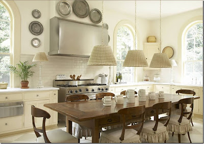
Nine months ago, I went into a custom built home that took my breath away. I had left my kids in the car as I raced through the house. When I came out, the kids said, "What did you think?" and I said, "The light fixtures were absolutely delicious!!!!" My kids looked at me like I was a weirdo, but I really think that my mouth began to salivate as I coveted all of the Circa Lighting pendants & sconces. (FYI: the interior designer for this breathtaking house was the super talented, Wendy Barze.)
Earlier this week, the good Lord was smiling down on me when I stumbled across the Circa Lighting Facebook page. And what to my wandering eyes should appear...but a "Black Friday WEEK" sale at Circa Lighting. It was 7:30 a.m. on Tuesday morning. I quickly formulated a plan to drive my kids to Gadsden and then drive to Hotlanta to see what deals I could find.
Long story short, I spent 3 hours in the store with the most patient salesperson, Teri Edler. She helped me create some fabulous "lighting-scapes" for each room. I am SO glad I made that trip to the ATL!!!
Check out some of our "lighting scapes"...
BTW, the other night I went to see Twilight New Dawn. Just as Bella is about to die from her weird pregnancy, I lean over to my fellow "Twi-hard Mom," Rachel, and say, "Look at those fabulous Circa Lighting Caged Lantern pendants with paper shades above the island. Aren't they wonderful?"
(NOTE: please refer to my previous blog post about the fact that when everyone else is crying in a sad moment in a movie, I, on the other hand, find myself noticing the set design.)
When it comes to lighting, I guess you can say that I am a huge fan of clean simple lines. The way I see it, if the accessories can make the dress, then the same can be said for the right lighting. It can make a space better than you ever imagined!
Friday, November 25, 2011
Saturday, November 19, 2011
Kitchens: the hub of our home
I have been saving "the big one" to talk about until I had all of my ducks in a row and I had a clear vision on the look that I was going for. You all may remember from several blog posts back that I gave up a basement for this...so it better be worth it!
Here goes...
It all began with this picture of this kitchen ceiling...
which as you can see,
had the "Dave Gray coffee shop" eat-in area
Something about this layout struck a cord with us and we designed our entire house around this concept.
Because I am a "visual person", I decided to mock up my cabinet layout so I could take it to meet with the cabinet builder. I could immediately tell from his reaction that he thought he was dealing with a "crazy person".
 |
| range wall |
 |
| frig wall |
As the crazy person that I am, I decided to go for it and push the cabinet builder over the edge by presenting a plethora of kitchen images to confuse him even more.
First, I started with images of kitchens with the range in between 2 windows.
 |
| Interior Designer: Betty Burgess |
 |
| Tracery Interiors |
Next, I kicked into high gear with photos of pantry walls and islands.
Let me tell you, he was psyched!
 |
| Lee Kleinhelter |
 |
| Tracery Interiors |
 |
| Wendy Barze, Marjorie Johnston Interiors |
But seriously, the cabinet maker, Tim at McCormick Cabinets, was the nicest guy! I appreciated his patience with me considering he had just finished a 48 hour shift at the Mountain Brook fire department. I only made the poor man sit there and listen to me ramble on for 4 hours.
SIDE NOTE:
And while I'm talking about patience, there may be an award given to our builder, Byrom Building. They both have endured my countless emails, all with multiple photos attached. Marty & Colt have the "patience of Job" and are the nicest people to work with. We couldn't have selected a better pair of guys to help us along this LONG bumpy road to finally getting this house built! And as my son, Jack Gray, would say, "THANKS A LATTE!"
Monday, November 14, 2011
Riding Shotgun
(by guest blogger, Dave Gray...Susan's loving husband)
After more than two years of searching for, then designing, and eventually overseeing the construction of Daxko's new home, I had no plans for another building project. However, after taking possession of our new office at 5:00 one Friday evening in May 2011 (see photos below), we received our final draft of our new home's blueprint from the Williams Partnership at 5:15 that same day.
So I got a whopping 15 minutes off between construction projects.
For our home construction project, I knew I wouldn't have the time to get deep into the details. Since I trust Susan's taste, once the blueprints were finished, I've tried to stay out of her way...other than enforcing the budget when necessary.
This has me riding shotgun on a pretty big endeavor for our family. For an admitted control freak, it is a big deal when you consider the resulting home will hopefully be where we raise our kids the majority of their childhood and where Susan and I plan to stay...at least until we're empty nesters.
My decision to play a secondary role was made easier for me for three main reasons. First, I was involved in every detail of our new 32,000 square foot workspace, which Susan says allowed me to express my inner "urban loft" desires, and I wasn't eager for another such project. Secondly, I simply don't have the time, and instead I need to stay focused on work to ensure we can actually pay for this project. And finally, it's probably best for our relationship if there's only one driver on this bus. As my father-in-law is fond of saying..."I'm happy when she (i.e. the wife) is happy."
Although I typically like to be in control, I like surprises too...a bit of a paradox I must admit. So as I ride shotgun, there is much going on with the design that I'm not even aware of. From lighting and bath fixtures to external paint colors and flooring. I had to ask Susan to give me the examples I used below...it's the first time I've seen most of them.
Of course, throughout, Susan shows me ideas she hunts down from her favorite design blogs and images among her 41 boards on Pinterest. She'll ask me my opinion on an idea or help in making the final call between a couple of her final options. To make the calls fall her way, she believes that if she refers to any of her choices as "clean" or "contemporary" I'm more likely to sign-off on a selection (back to the whole "urban loft" thing).
Not being in the driver seat on this journey is going to allow this project to be a series of small surprises as it unfolds. This is particularly the case when I'm traveling. For instance, I'm headed to Chicago soon for a couple days, and I'll look forward to seeing what's been done and what new decisions have been made in my absence.
So although I don't like her driving when I'm in a real car. In this case, I'm more than happy to ride shotgun.
After more than two years of searching for, then designing, and eventually overseeing the construction of Daxko's new home, I had no plans for another building project. However, after taking possession of our new office at 5:00 one Friday evening in May 2011 (see photos below), we received our final draft of our new home's blueprint from the Williams Partnership at 5:15 that same day.
So I got a whopping 15 minutes off between construction projects.
 |
Photos of Daxko's new headquarters designed by Ray Harsh Design and built by Murray Construction, both businesses owned by fellow Homewood residents. Photography by Liesa Cole |
For our home construction project, I knew I wouldn't have the time to get deep into the details. Since I trust Susan's taste, once the blueprints were finished, I've tried to stay out of her way...other than enforcing the budget when necessary.
This has me riding shotgun on a pretty big endeavor for our family. For an admitted control freak, it is a big deal when you consider the resulting home will hopefully be where we raise our kids the majority of their childhood and where Susan and I plan to stay...at least until we're empty nesters.
My decision to play a secondary role was made easier for me for three main reasons. First, I was involved in every detail of our new 32,000 square foot workspace, which Susan says allowed me to express my inner "urban loft" desires, and I wasn't eager for another such project. Secondly, I simply don't have the time, and instead I need to stay focused on work to ensure we can actually pay for this project. And finally, it's probably best for our relationship if there's only one driver on this bus. As my father-in-law is fond of saying..."I'm happy when she (i.e. the wife) is happy."
Although I typically like to be in control, I like surprises too...a bit of a paradox I must admit. So as I ride shotgun, there is much going on with the design that I'm not even aware of. From lighting and bath fixtures to external paint colors and flooring. I had to ask Susan to give me the examples I used below...it's the first time I've seen most of them.
 |
| Pendant light in my home office. |
 |
| Faucets for our master bath. |
 |
| The approximate paint color for our cedar shingle. |
 |
| Flooring for our mudroom and laundry room. |
Of course, throughout, Susan shows me ideas she hunts down from her favorite design blogs and images among her 41 boards on Pinterest. She'll ask me my opinion on an idea or help in making the final call between a couple of her final options. To make the calls fall her way, she believes that if she refers to any of her choices as "clean" or "contemporary" I'm more likely to sign-off on a selection (back to the whole "urban loft" thing).
Not being in the driver seat on this journey is going to allow this project to be a series of small surprises as it unfolds. This is particularly the case when I'm traveling. For instance, I'm headed to Chicago soon for a couple days, and I'll look forward to seeing what's been done and what new decisions have been made in my absence.
So although I don't like her driving when I'm in a real car. In this case, I'm more than happy to ride shotgun.
Subscribe to:
Comments (Atom)


